Version 1
Version 2
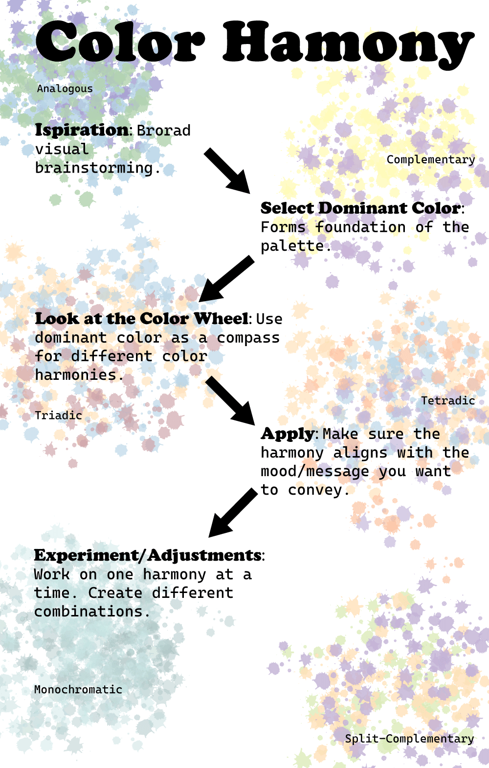
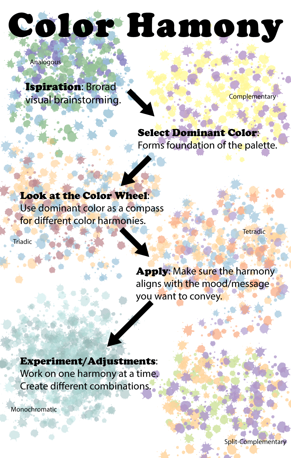
I choose to do an infograhic on color harmony. In the version one I used "Cooper Black" and "Myraid Pro" for the font choice. For the background, while using a ink drop brush, I took each type of the color harmonies give each step a different background. There also are bold black arrows to guide the reader through the different steps of how to choose a color harmony. Each background blob of color is labeled with which type it is. The feed back I recived was that the fonts need to be changed, the background was competing with the text, the background was messy, and the text wasn't align. In version two I changed "Myraid Pro" font to "Cascadia Code" to give more of contast. I also changed the opacity of the background from 50% to 35%, and seperated the groups of color more so that way it didn't compete as much. I also fixed the spacing and the alignment of the text.